
Nudge. Change position. Change label. Undo. Redo. You hit a wall. You think about deleting everything and starting from scratch.
Then, an idea hits!
You race after it, leaving a stream of frames and layers behind you. Looking over your canvas filled with colourful shapes, you feel like you’ve really diverged in a creative way.
But have you actually made progress? What decisions did you make exactly? And are you any closer to a solution? Often, it’s not clear. And sometimes there’s a sinking feeling that you’ve actually gone backwards.
This random, slightly automatic way of designing can make it difficult to feel confident about what you’ve made, and can be painful for your collaborators. Engineers can’t find the ‘latest’ design and design crits and reviews can suffer from murky rationale. Not great.

A method to the madness
Inspired by another designer, who was much more methodical and measured than me, I started to experiment with a different way of working.
It looked something like this:
Each new approach is labelled (eg. “Full width panel). Variations or iterations related to it are also labelled and grouped together.
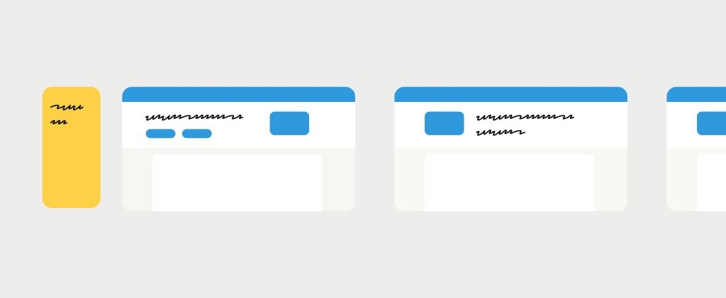
Then, when you’re ready, you create another direction and branch into related solutions from there.
Why this worked for me
At the time, I had started to work on product experiments, usually described as “growth design”. This meant I was thinking about smaller changes to workflows that could be built and tested rapidly.
Every solution also required a strong prediction or bet about how it would move a metric, expressed as something like “If we do X, then Y will happen, because X”.
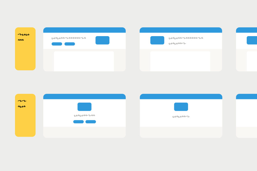
Using this structure, I could organise my design file like a spreadsheet, with each hypothesis followed by a series of ideas. Once I felt I had exhausted that line of thinking, I moved onto a different hypothesis and another “row” of executions.
I remember reading about how designers at Spotify worked in a similar way. They called it “thoughtful execution”. Spotify designer Annina Koskinen explains why it’s important to explore multiple hypotheses (rows) and multiple executions (cells).
“Any problem or opportunity can be addressed in multiple different ways with varying results. That’s why it’s important to create multiple hypotheses per opportunity to see which one leads to the most desirable results. Each of the hypotheses can have several solution executions, so you can’t prove or disprove a hypothesis by just trying out one design solution.”
Aside from being a helpful way to organise and keep track of experiment solutions, I noticed a few other benefits:
1. More creativity
We have funny rules in our heads about what counts as creativity. For me, I thought I had to be kind of messy and impulsive to find these lightbulb moments. I don’t think that’s true. Sometimes a little more constraint can force us to think out of the box (like the repetition of crazy 8’s).
2. More buy-in
Working from goal to hypothesis to solution gave me a chain of reasoning that helped a lot when I was presenting work to stakeholders. It’s easier to gain consensus progressively, at each of these stages (a bit like going from lo-fi to hi-fi). It can be much harder to find agreement when we present a piece of work that has a lot of different ideas and assumptions baked into it.
3. More intentionality
By labelling screens with a “why” (hypothesis) or a “how” (execution), I’m forcing myself to ask:
- What’s actually different here?
- What problem am I trying to solve that the last one didn’t?
- What am I actually exploring here? What do I want to see?
That little pause and questioning can help prevent you from doing and re-doing the same thing over and over.
With a bit of structure in place, it makes it easier to work effectively with tools like Gemini. Gemini can help suggest new solutions for existing hypotheses or generate altogether new hypotheses you may not have thought of.
Putting it to work
In general, I’ve enjoyed less chaos in my Figma files while keeping (I think) my creativity intact. So if you’ve ever felt yourself spinning wheels, re-doing stuff, losing track of decisions, try out this method.
Most of us where I work at Xero are designing complex tools and workflows with lots of moving parts, and we don’t have the need to test different dimensions in this way. But if you’re designing more specific changes or in a high-traffic space like a check-out flow, designing a bit more like spreadsheet might work for you.
